

BigCommerce Add-on: Mobile Menu For Discount
Description
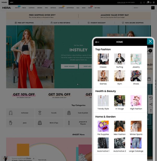
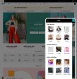
We are living in a mobile-first world. This growth has given web designers a challenge – with the obvious limitations of mobile devices, how do you design a good navigation menu for your website?
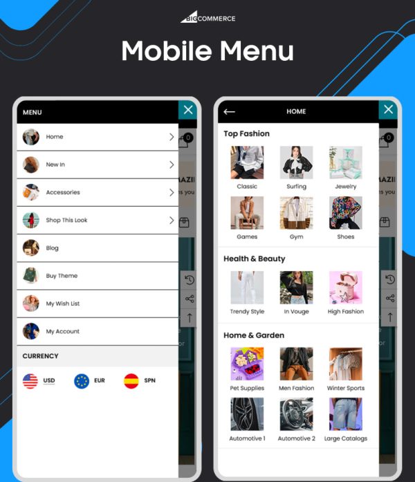
With BigCommerce Add on: Mobile Menu – We deliver to you the best menu layouts which are optimized well for Mobile, prevents your customers from feeling overwhelmed by a multitude of menu items from the traditional way shown on their small screen.
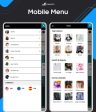
With this add on, your Mobile Menu will be different from Desktop, it offers you the maximum of flexibility.
* Easily to manage in the theme editor
* Work well with any Stencil BigCommerce Template.
* Optimized layout for Mobile First – Work best on all devices.
* Test demo store on your mobile to see how the add on works.
* Please note: Your theme must have Mobile Menu for available to use this add on. In case your theme doesn’t have Mobile Menu, an extra fee will be applied for the customization service.
Additional Information
| Title | Default Title |
|---|